Hi, there!
Call me Nadine — a creative designer inspired by the intersection of art, tech, and game development — visually communicating solutions and impactful stories through ever-evolving multi-platform initiatives and media.
(I love pixels, grids, and colors)
ABOUT
CASE STUDIES
MISC
ARE.NA
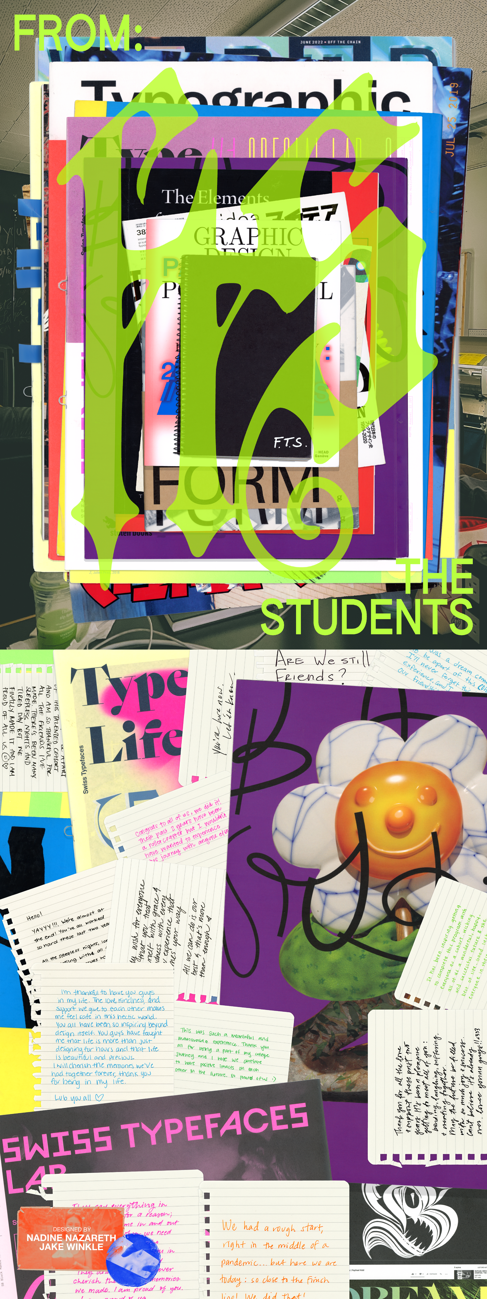
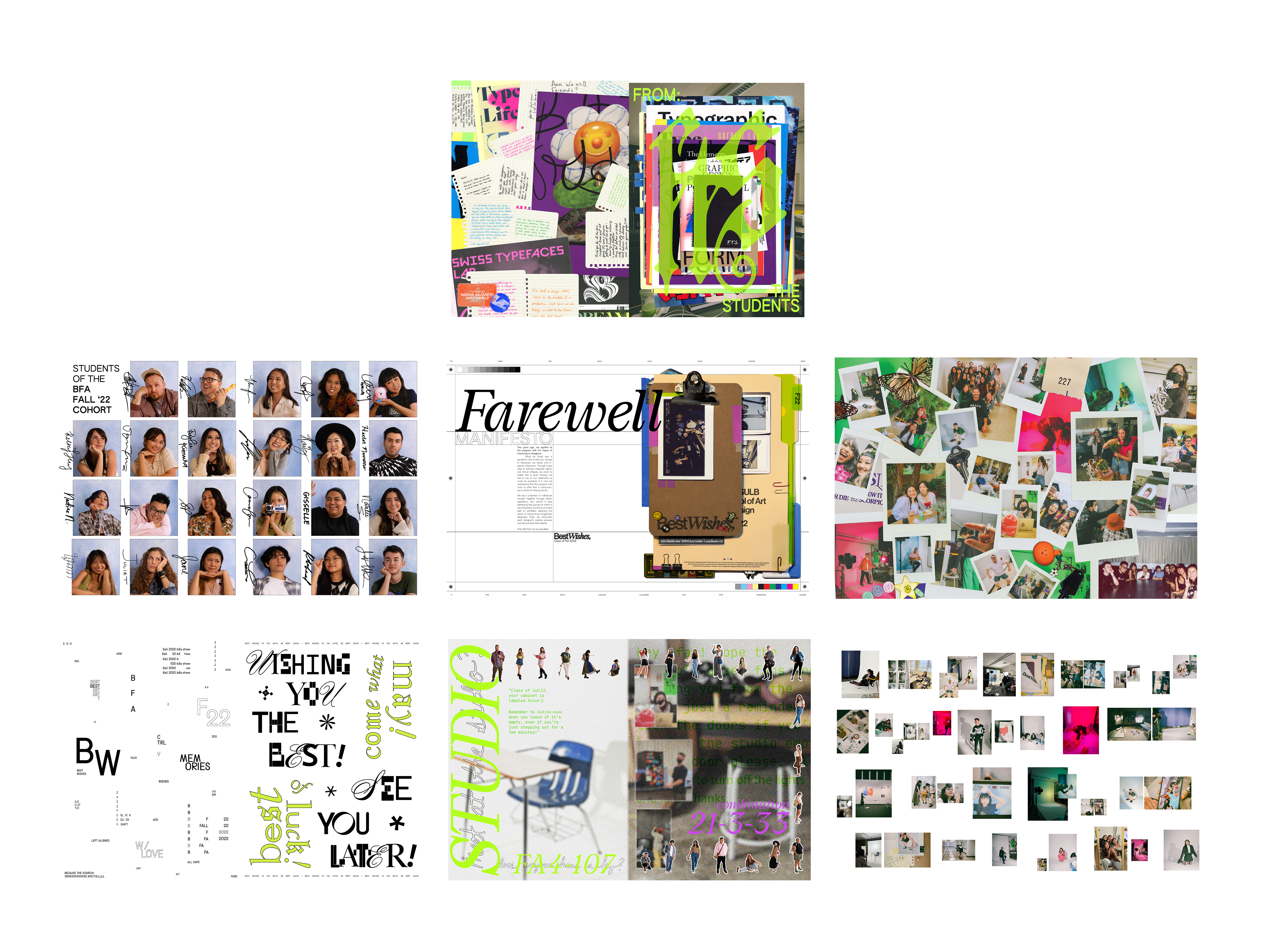
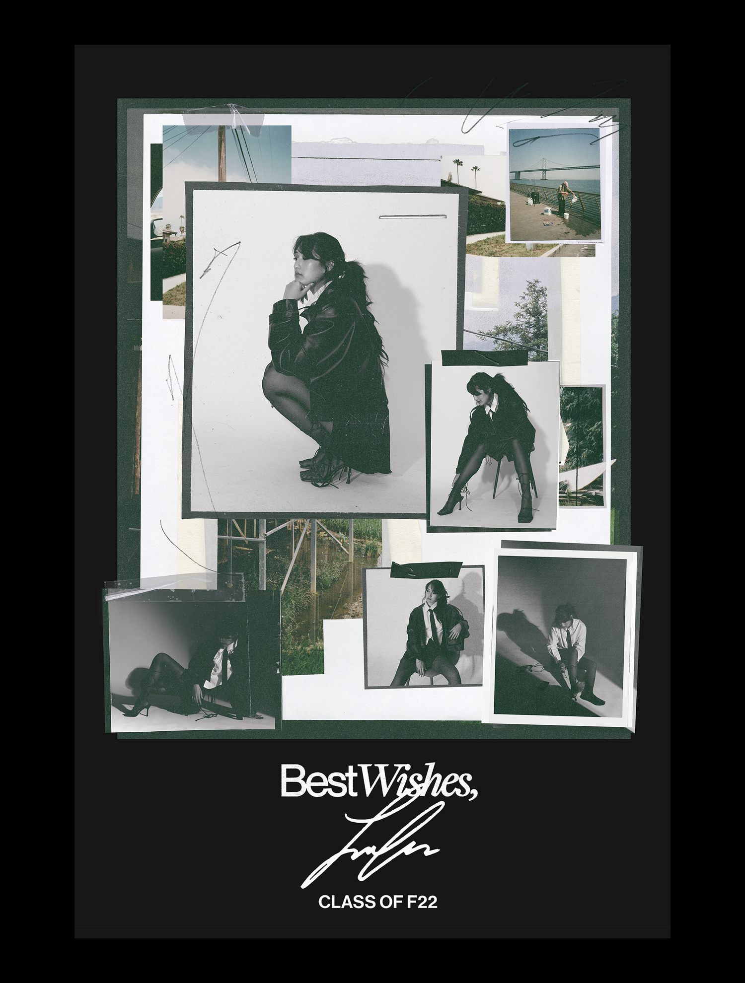
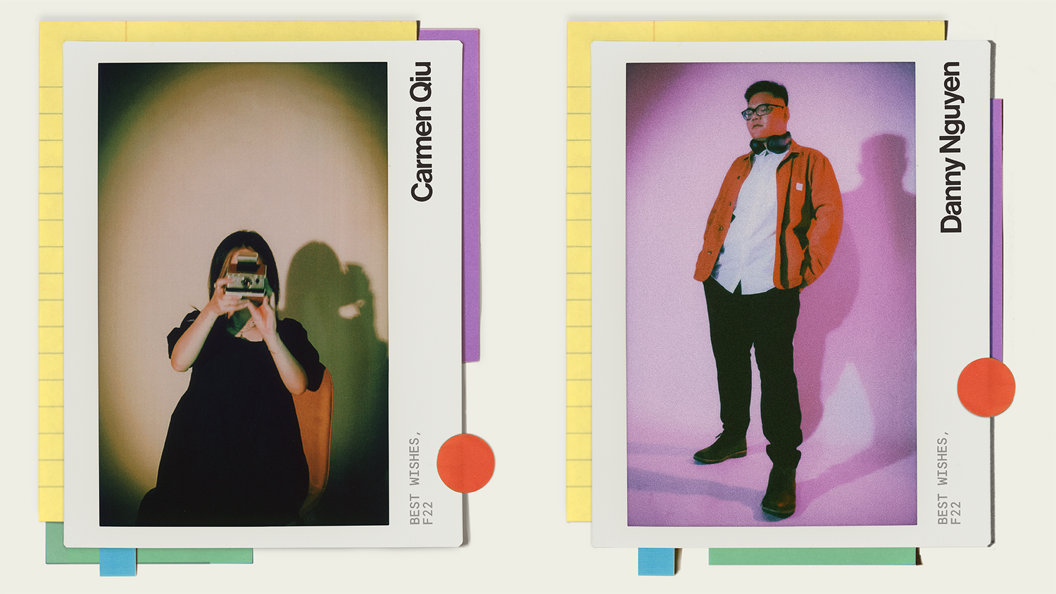
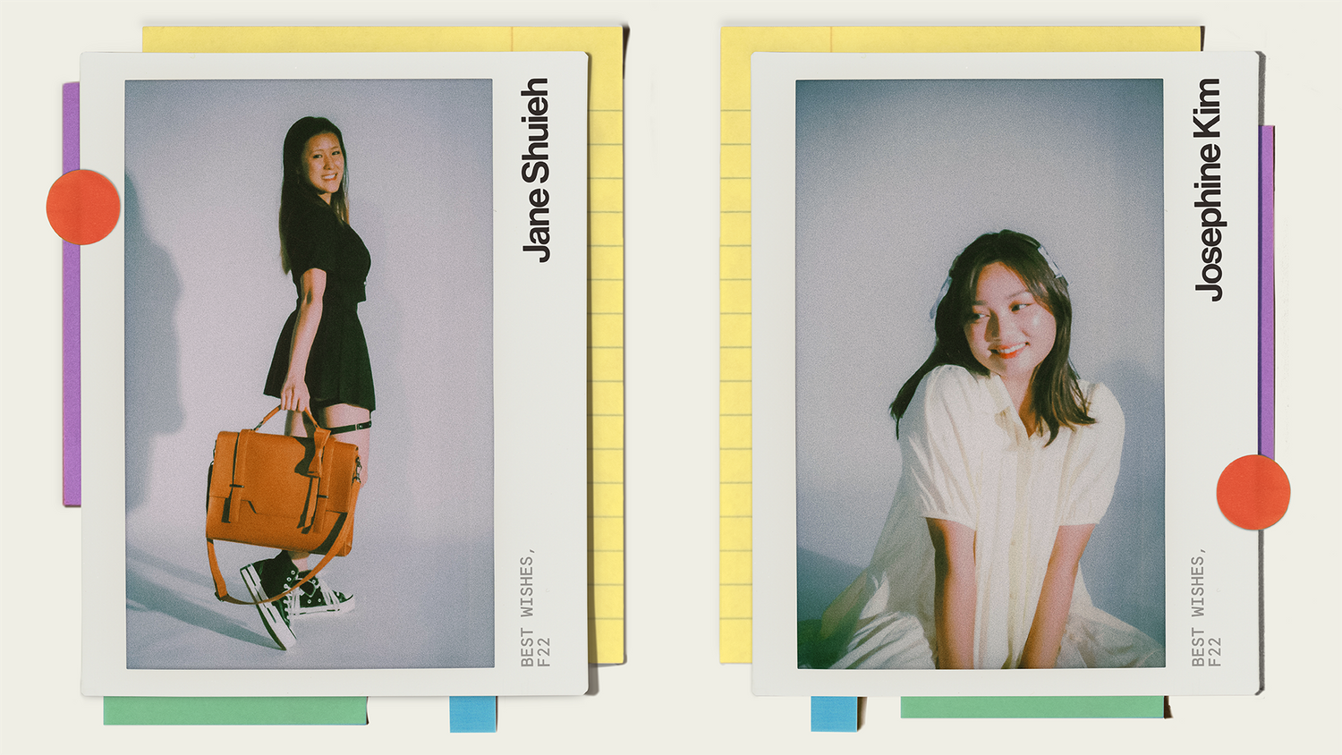
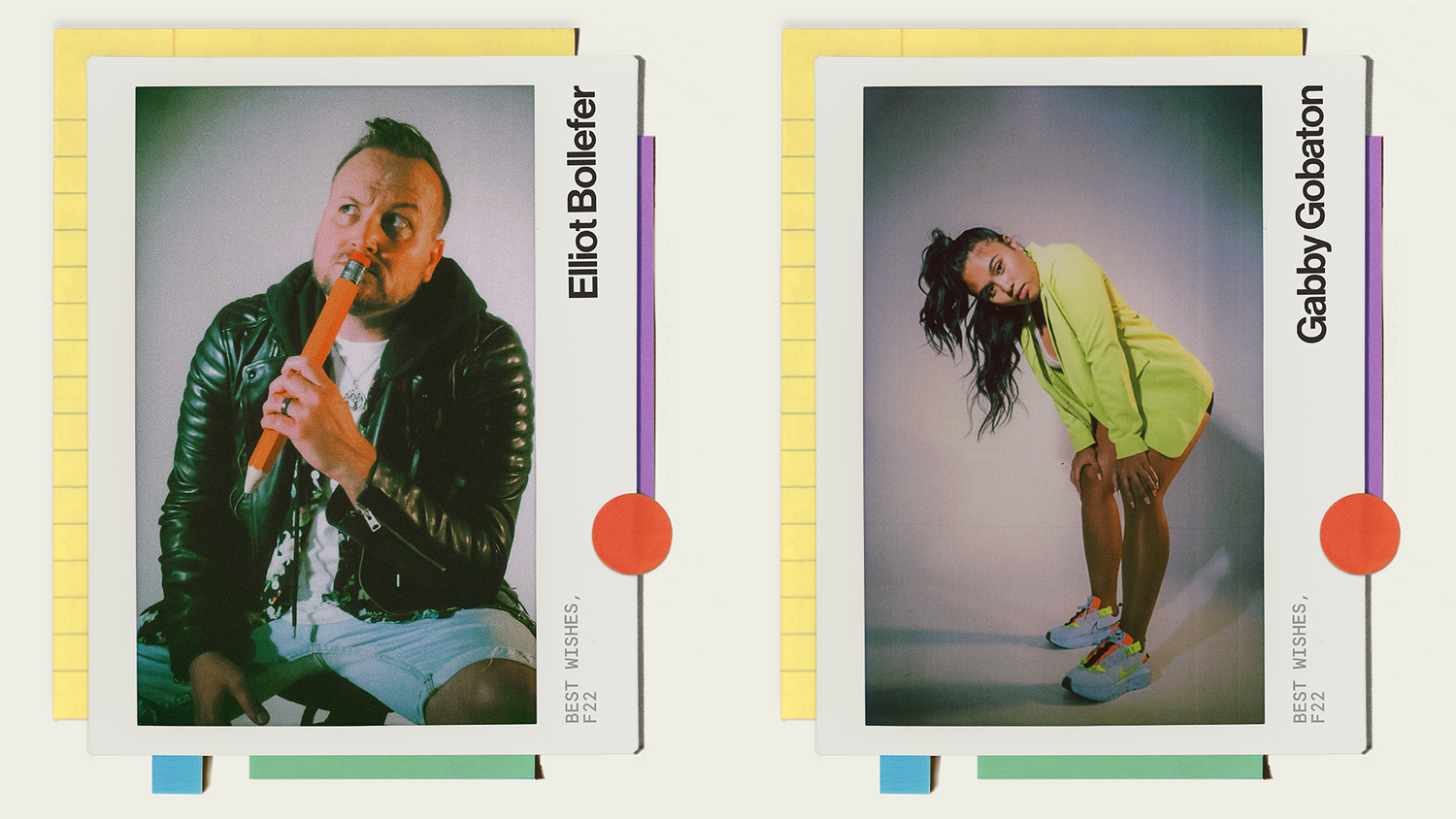
F.T.S. Magazine + Best Wishes Exhibition
Art Direction x Branding x Editorial Design x Print Production x Photography
A leadership and project management role, I was chosen to co-lead in concept development and organization of California State University’s School of Arts two-day exhibition and campaign for 2022, showcasing esteemed
top talent of fine arts students from the university; conceptualizing and producing visual identity and story-telling of “nostalgia, sentimentality, and camraderie” through brand and digital assets that were implemented across its campaign with the organization and cross-collaboration of merchandise, marketing, and environmental teams.
To add, it was essential to include a mass-produced editorial magazine designed and created for purchase. Contents include the exhibition’s showcased top talent--focusing on fun, eccentric, and reminiscent aspects, scanned materials, designed in a collage manner -- a culmination of stories, perspectives, and extensive work from talented individuals. Assets were treated in a collage/mixed media manner -- including scanned physical materials such as books, photographs, and letters that were carefully crafted and implemented to blend with experimental typography.
- - - - - - - -
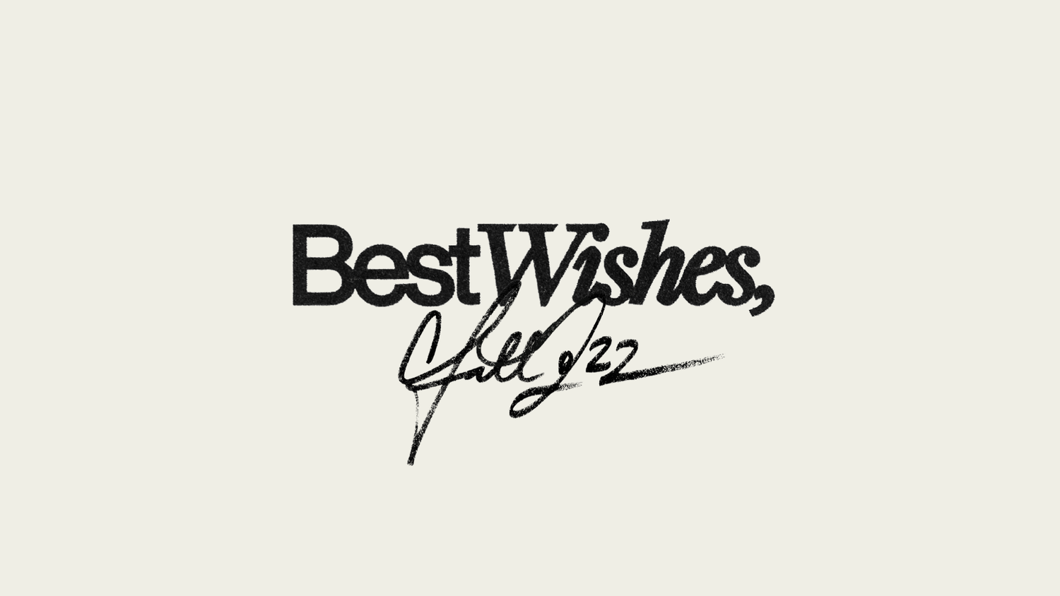
“Best Wishes,” campaign + Exhibition - Art Direction / collaboration with Tran Lam & Andrew Tran
“F.T.S.” Magazine - Art direction / collaboration with Jake Winkle
To add, it was essential to include a mass-produced editorial magazine designed and created for purchase. Contents include the exhibition’s showcased top talent--focusing on fun, eccentric, and reminiscent aspects, scanned materials, designed in a collage manner -- a culmination of stories, perspectives, and extensive work from talented individuals. Assets were treated in a collage/mixed media manner -- including scanned physical materials such as books, photographs, and letters that were carefully crafted and implemented to blend with experimental typography.
- - - - - - - -
“Best Wishes,” campaign + Exhibition - Art Direction / collaboration with Tran Lam & Andrew Tran
“F.T.S.” Magazine - Art direction / collaboration with Jake Winkle


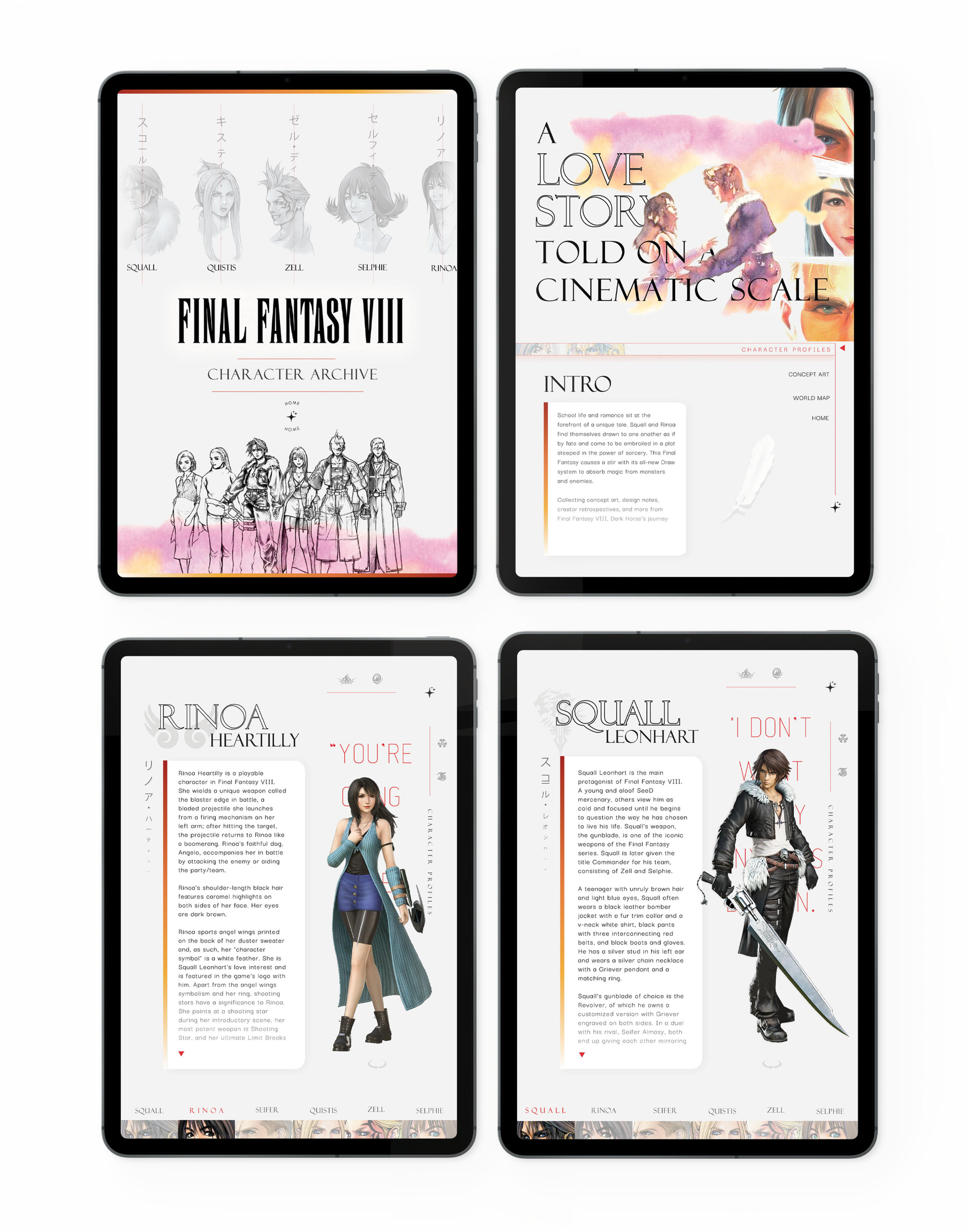
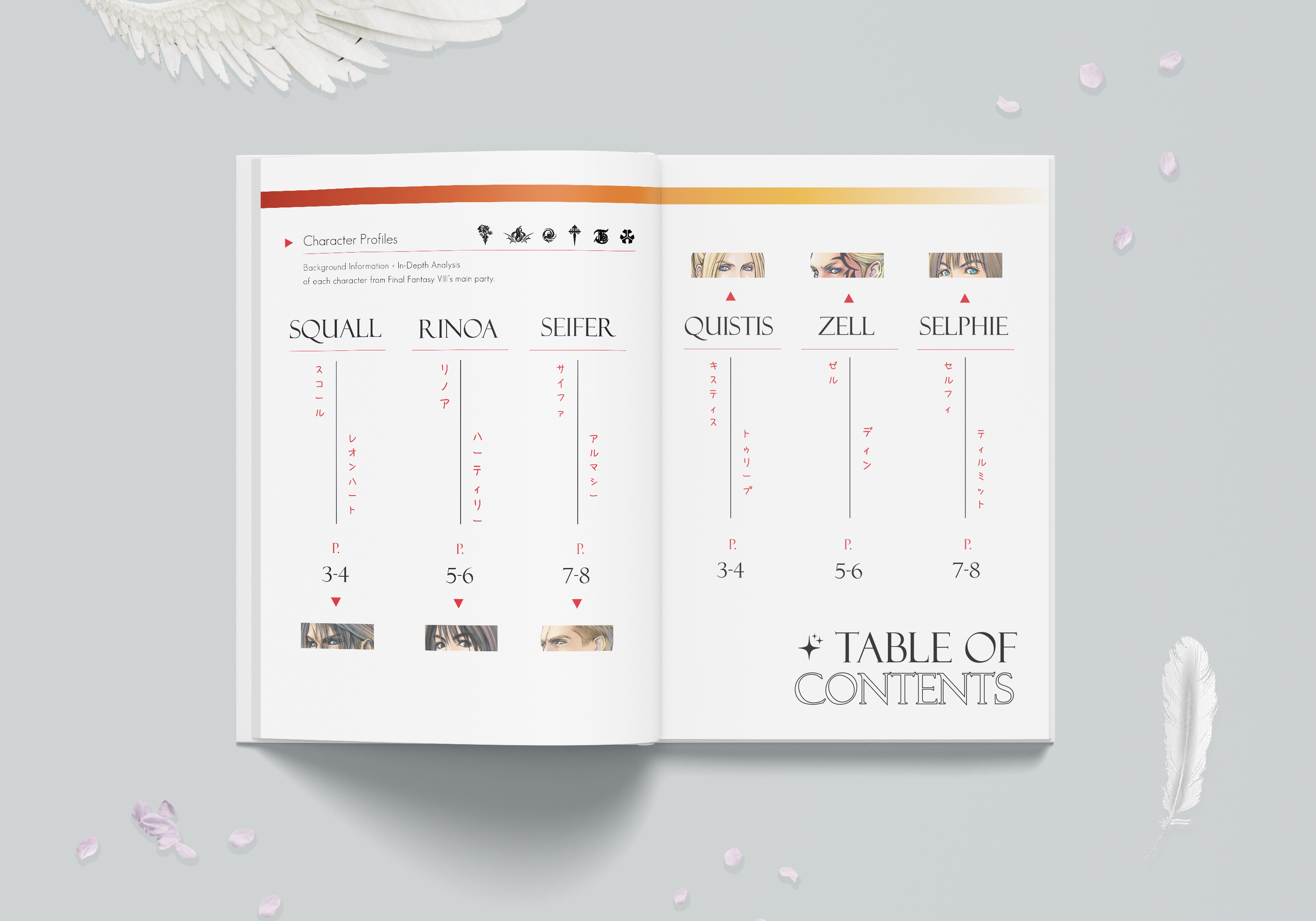
Final Fantasy VIII Character Archive
Branding x UX / UI Design x Layout x Social Media Marketing
A book and archival website re-designed & re-imagined of the Final Fantasy VIII Archive in an experiental format and in physical print which showcases concept art, background stories, and player information of characters from Square Soft’s Final Fantasy VIII video game in the format of an iPad Pro.
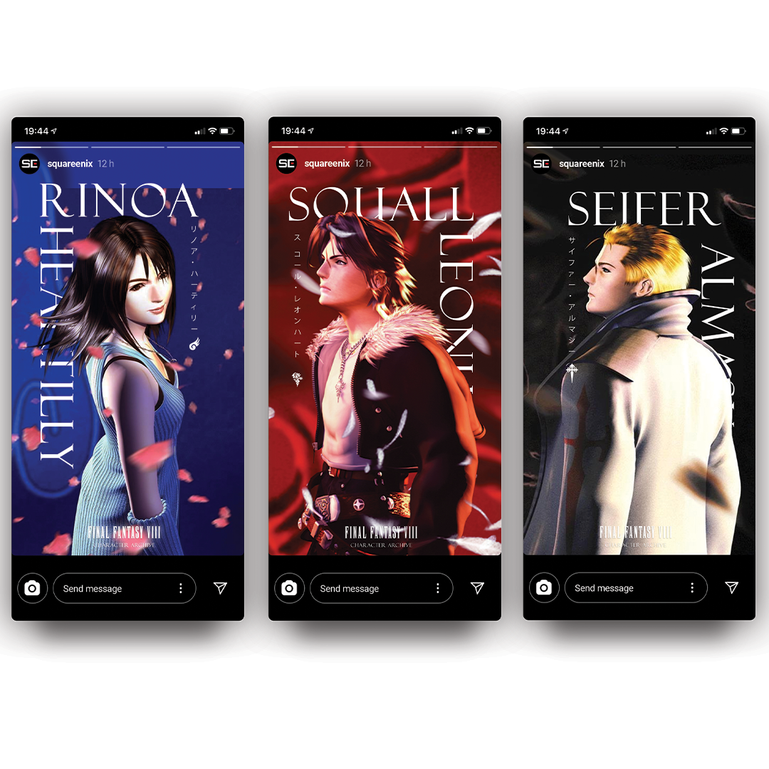
A social media campaign for Square Enix is showcased -- including instagram stories and posts to advertise the release of the archival book re-design and website while following the standards of the Final Fantasy series’s visual identity.
Credits to the Squall, Rinoa, and Sifer panel illustration: David Ardinaryas Lojaya
IPs are owned by Square Soft, Square Enix, and Dark Horse.


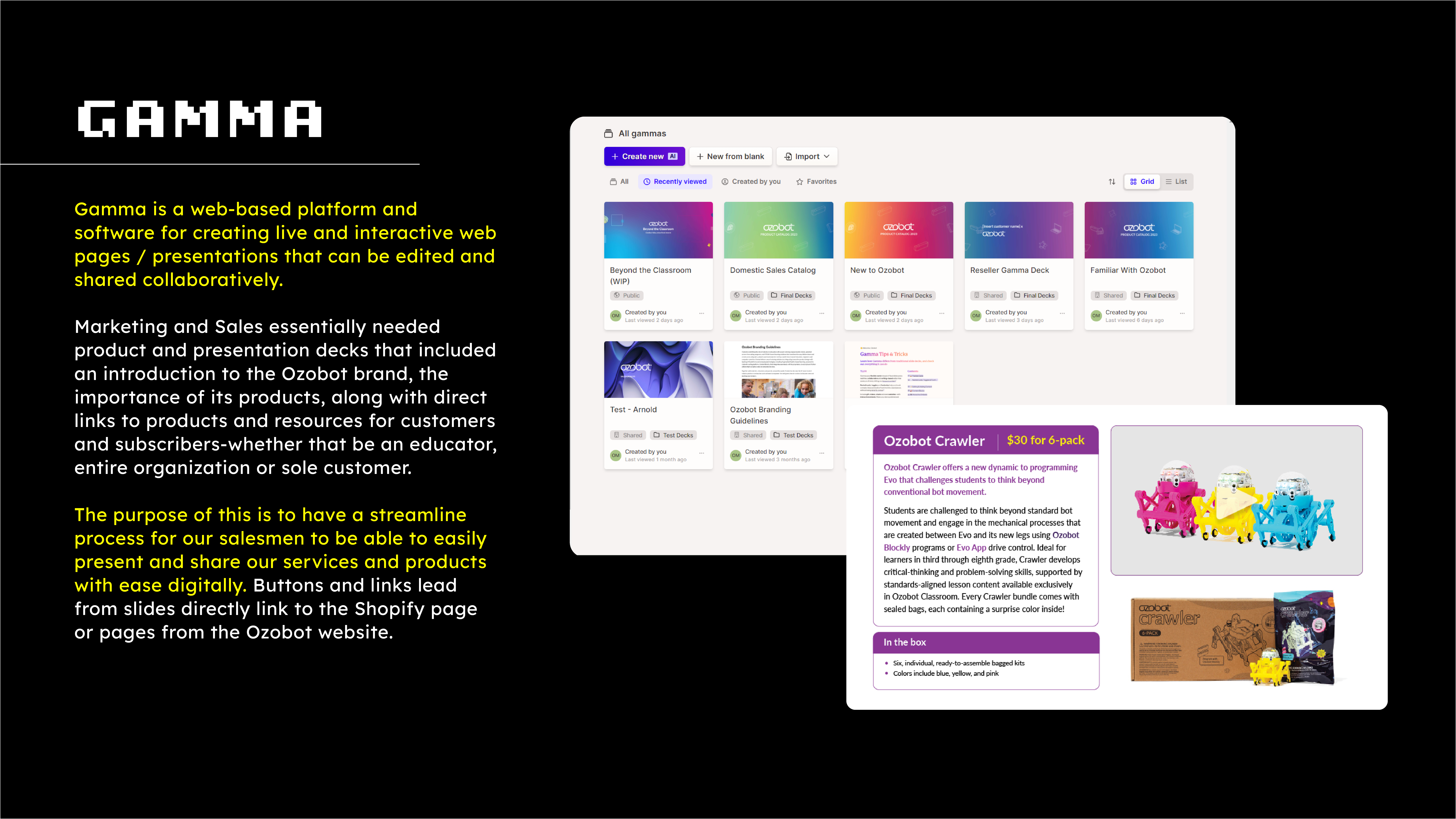
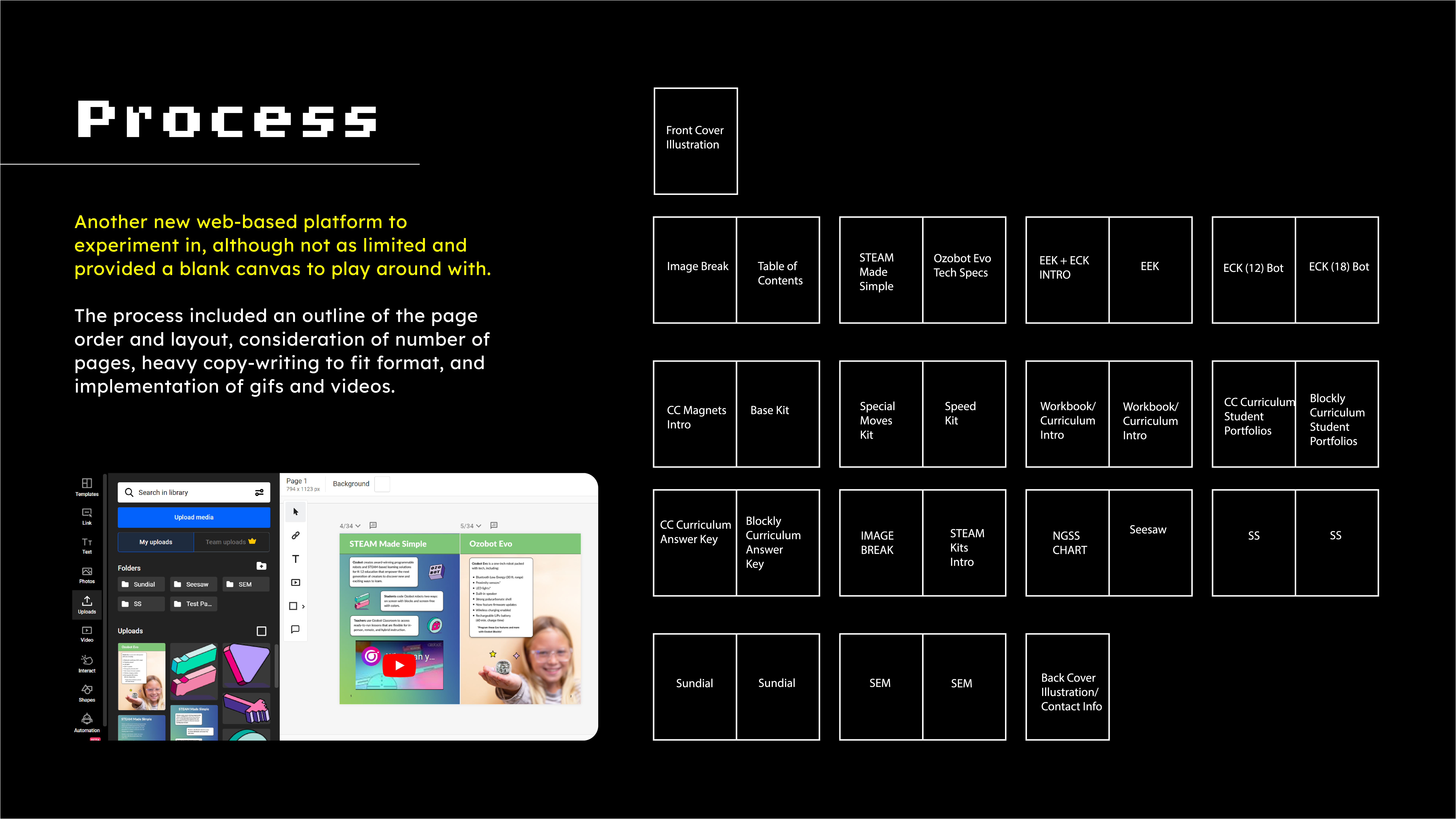
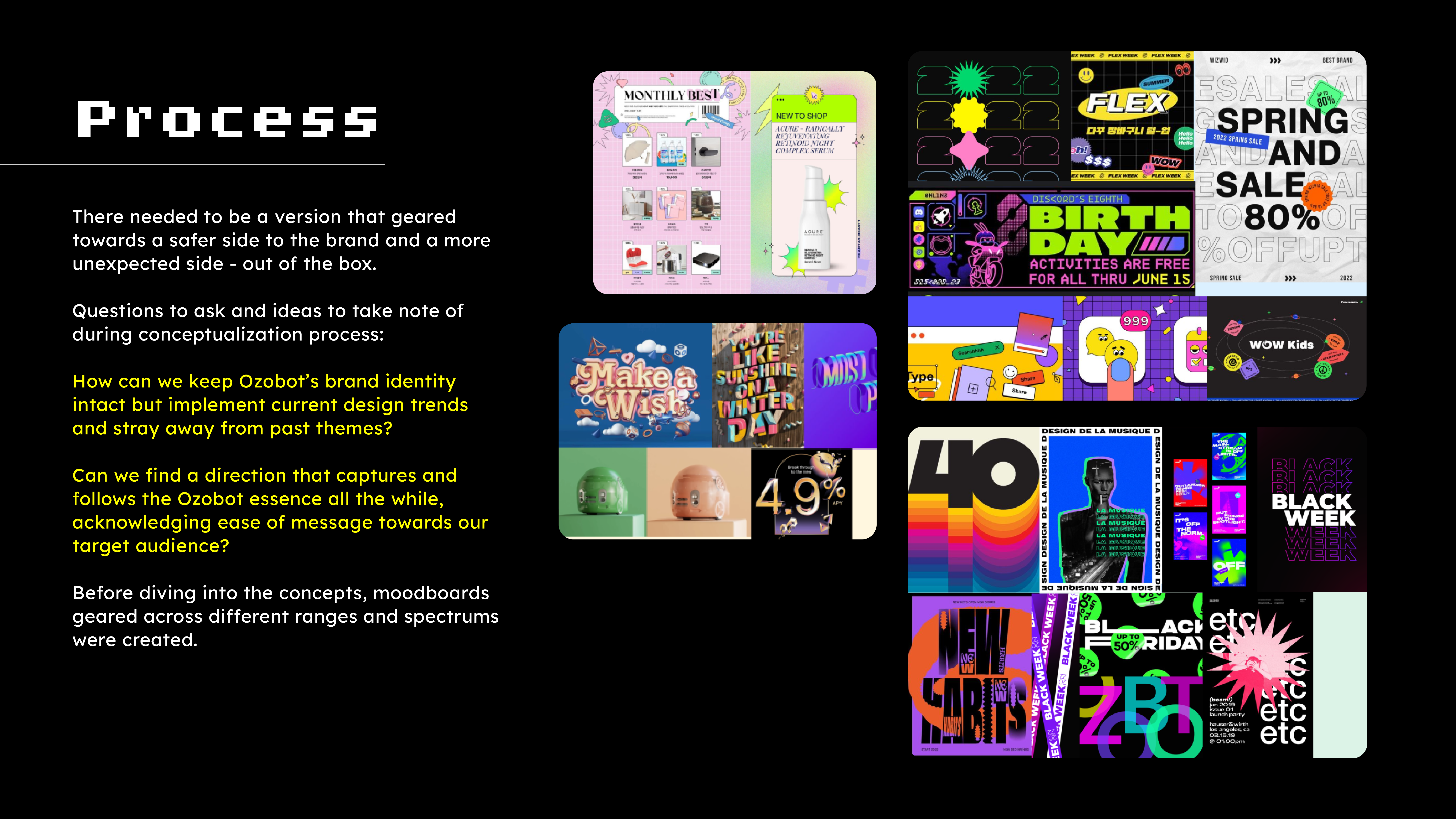
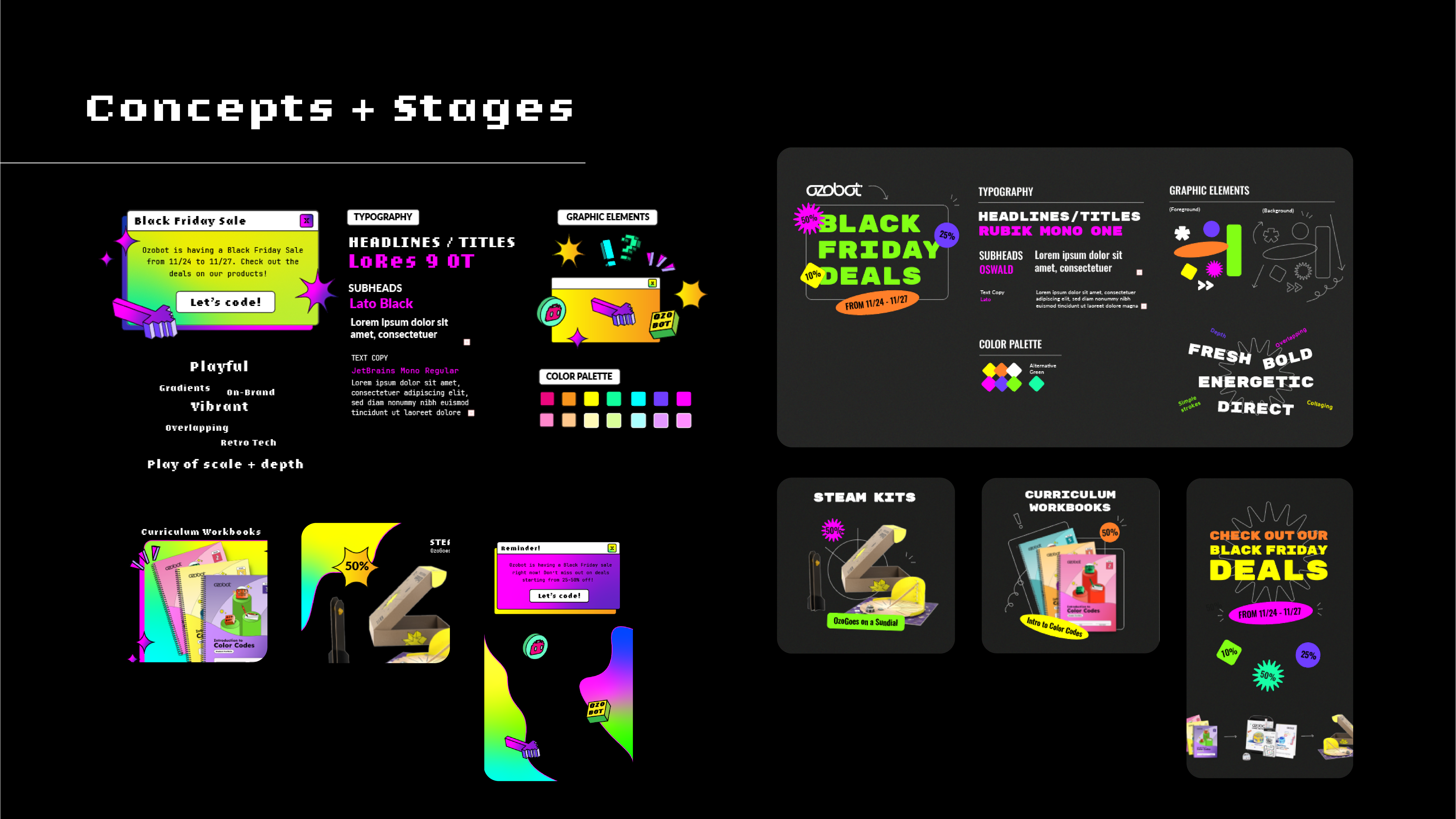
Ozobot Web + Marketing Showcase
Social Media Marketing x Campaigning x CRM / E-commerce Design x Web x Presentation
Ozobot Edu, Inc. is an educational tech company focused on encompassing educators, children, young adults, and STEAM forward organizations the ability to teach how to learn and play with STEAM-based products -- coding and programming robotics and accessories.
These are highlights of marketing / sales campaign ventures and presentations during my time at Ozobot, led and explored by me, with brief conceptulization, experimentation of new web-based/cloud-based/interactive platforms, strategy, branding process, and final thoughts and product.
These are highlights of marketing / sales campaign ventures and presentations during my time at Ozobot, led and explored by me, with brief conceptulization, experimentation of new web-based/cloud-based/interactive platforms, strategy, branding process, and final thoughts and product.


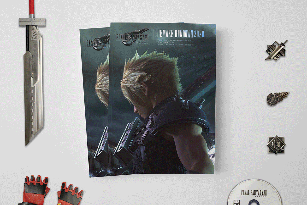
Final Fantasy VII Remake Rundown
“FFVII Synopsis Magazine”
Branding x Editorial Design x Print Production
An editorial exclusive Final Fantasy VII Remake mini synopsis magazine, in its first installment.
Contents reveal a brief intro and synopsis to the game, providing a backstory on Cloud Strife, his recent relations with “eco-terrorists” AVALANCHE, Shinra’s motives, and Sephiroth’s goals that tie in with the planet.
The Final Fantasy VII logo is kept on the front cover and the video game franchise’s font (OPTIEngeEtienne) is used throughout the magazine in main titles/headlines per page--a way to keep their iconic font recognizable for fans.
The franchise, made by the Square Enix video game developing company, keeps a certain elegance with a modern take with their themes in visual design. Image editing/manipulation, color correction, layout design, and typography were heavily used to create dynamic, yet consistent brand design for use of IP and content.
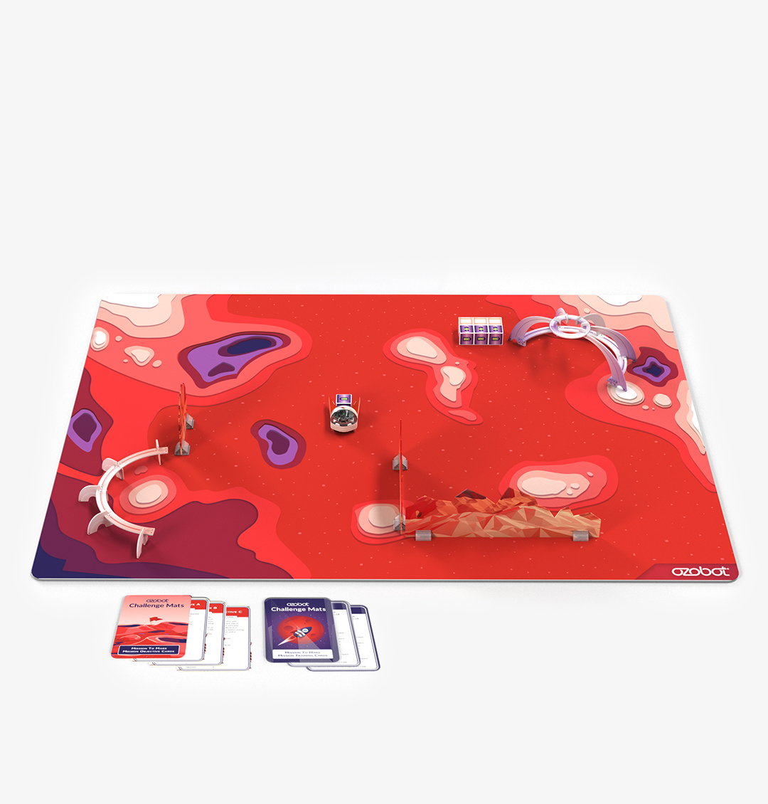
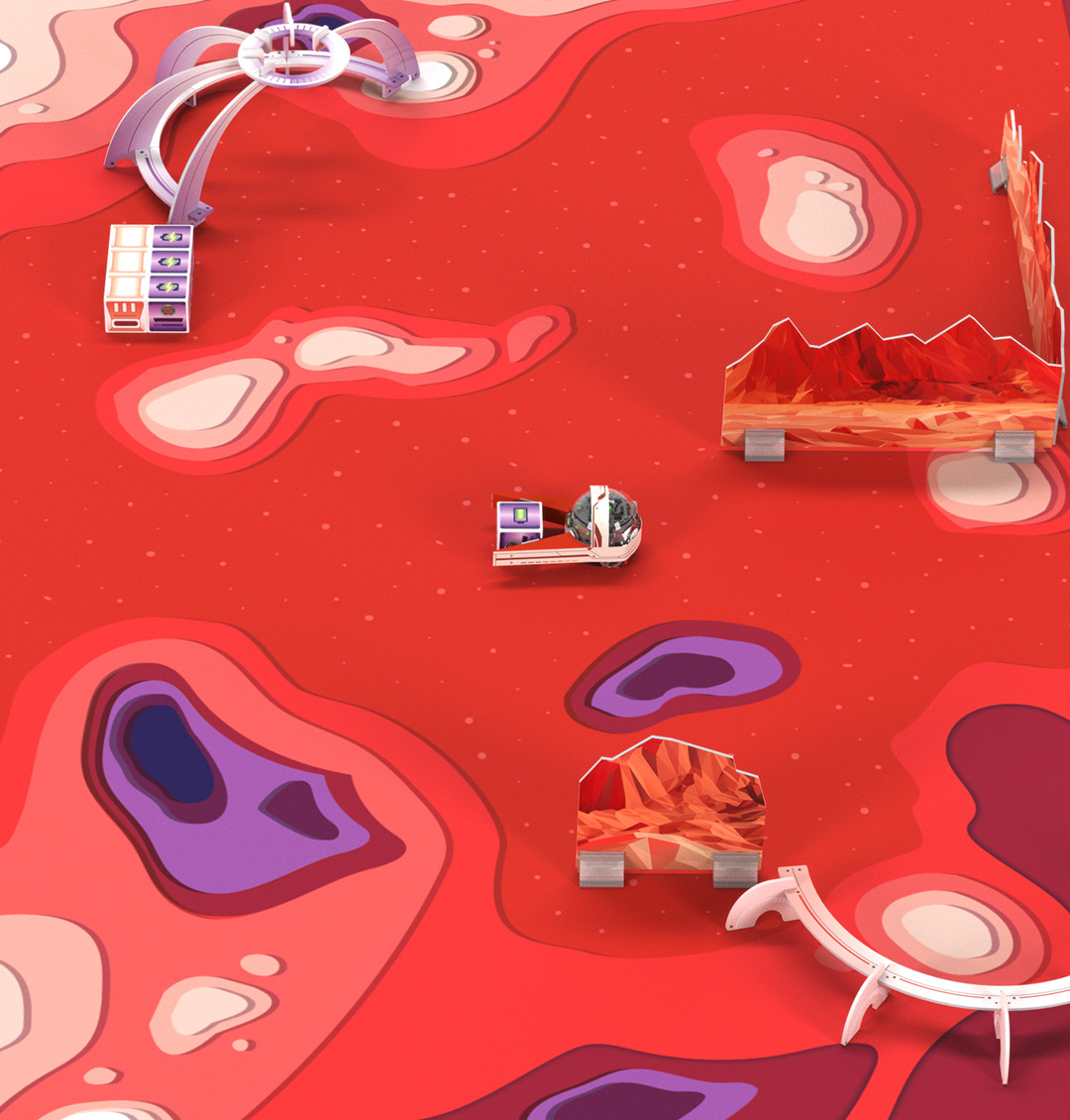
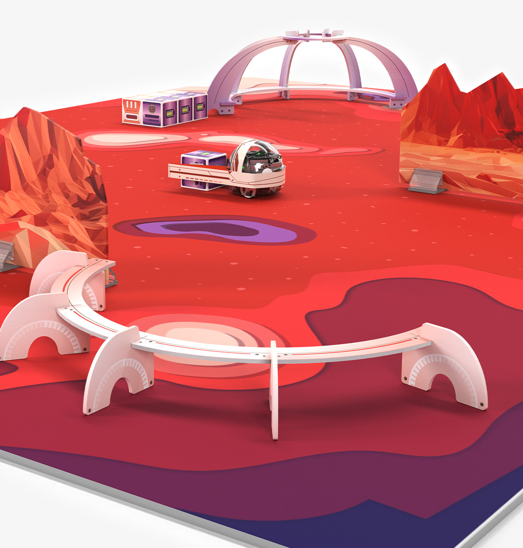
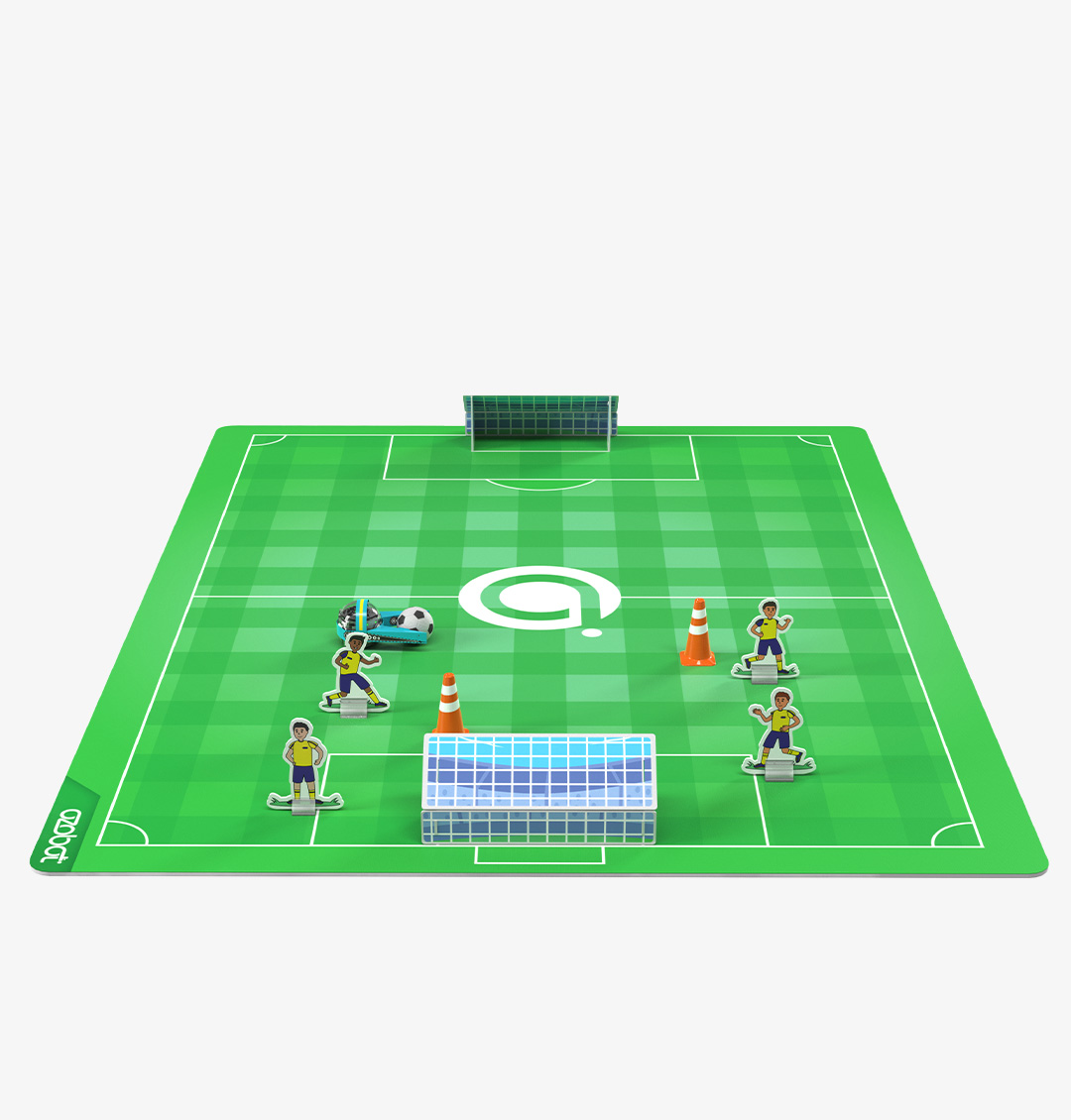
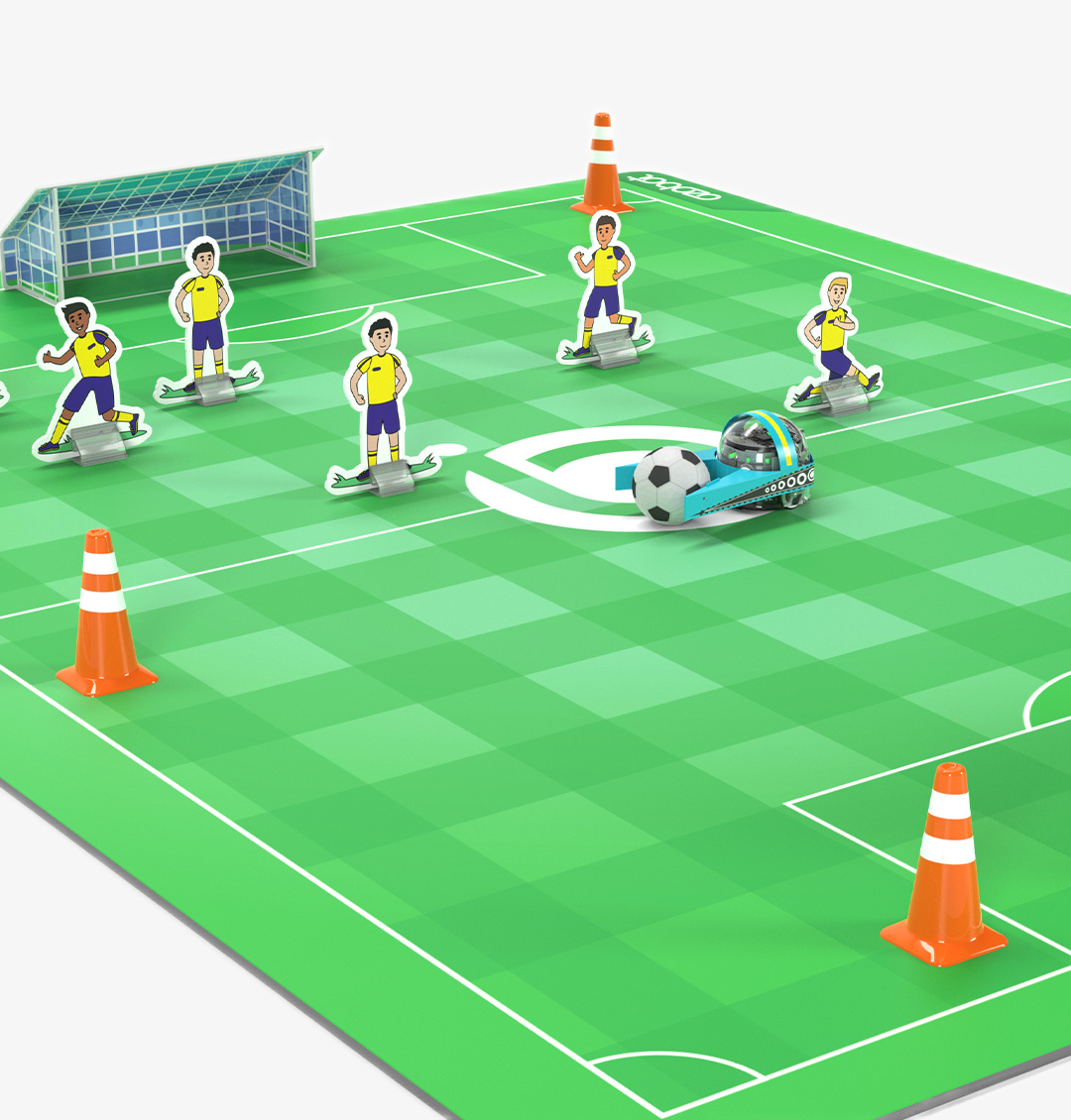
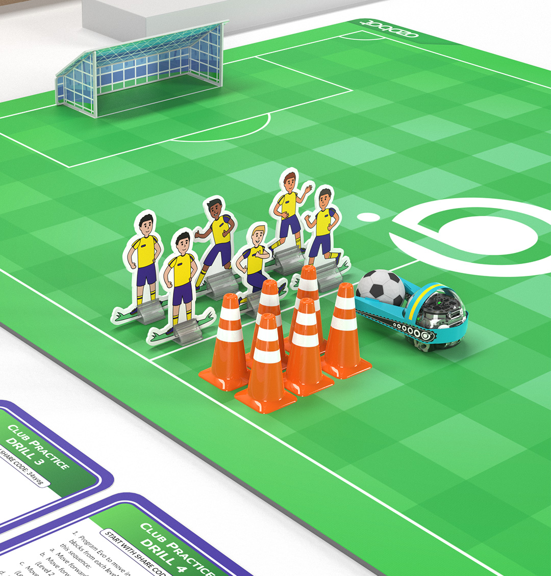
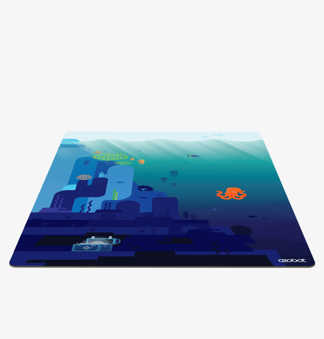
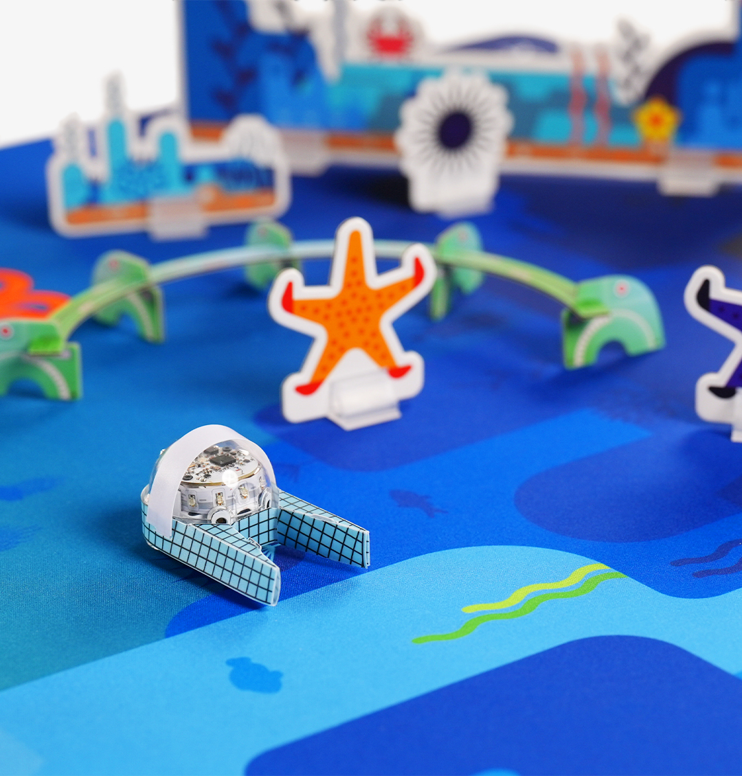
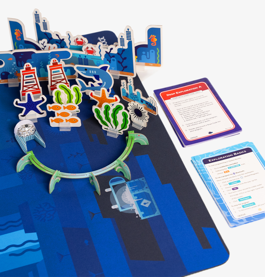
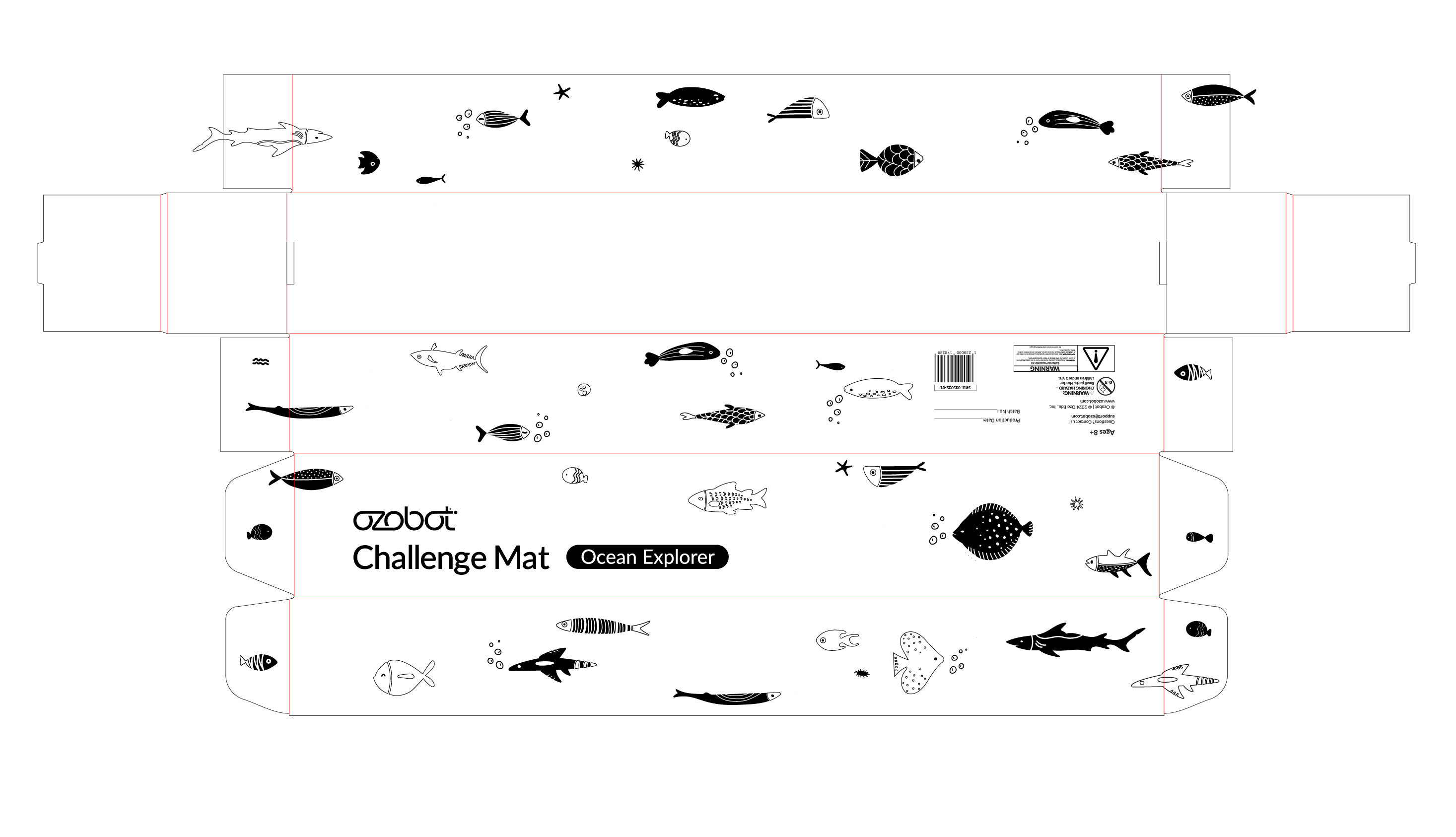
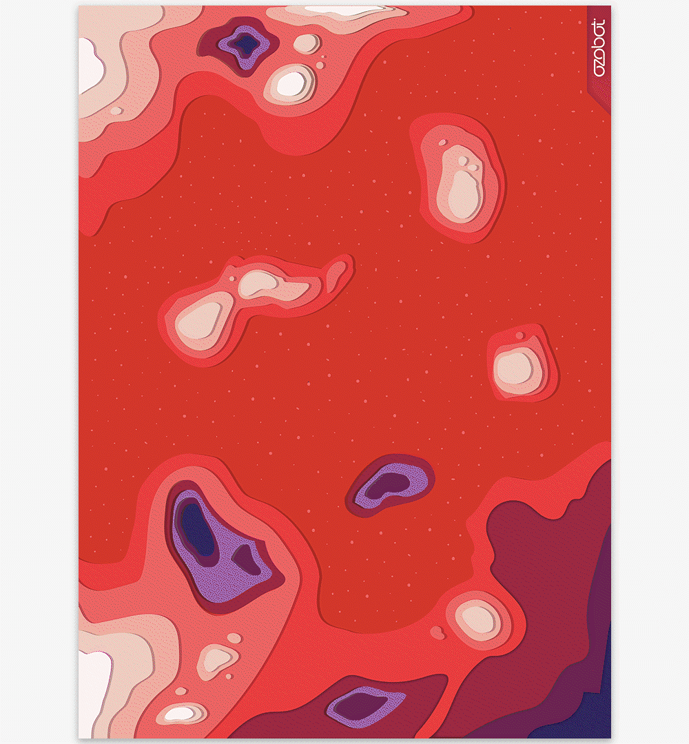
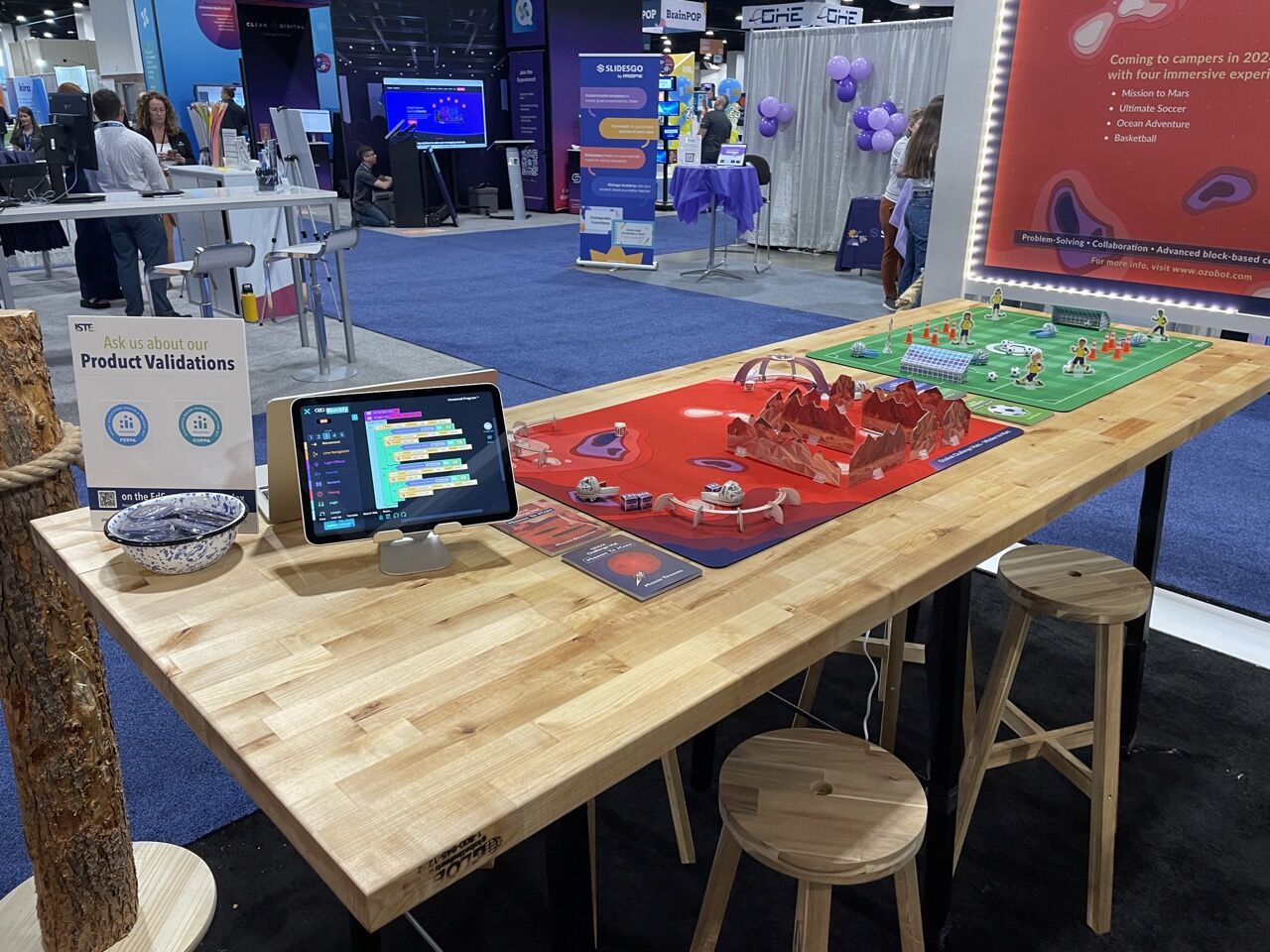
Challenge Mats
Art Direction x Conceptualization x Research & Development x Product Packaging
Ozobot Edu, Inc. is an educational tech / robotics company focused on encompassing educators, children, young adults, and STEAM forward organizations the ability to teach how to learn and play with STEAM-based products -- coding and programming robots and accessories.
A STEAM focused product, Challenge Mats pave a way for young coders to challenge themselves on coding and programming Evo, the one-inch robot, on various environments and arenas with obstacles and missions to complete.
These Challenge Mats are a complete kit with designed accessories for Evo, challenge cards, and a 24" x 33" coding mat with themed skins.
These coding mats are currently an ongoing process since 2023 and continuously evolving. I led the early stages of conceptualization, process, imagery, iconography and print production up to the prototyping and demos of these products, with the aid of cross-collaborating the creative, product, curriculum, and engineer teams of Ozobot.
More Challenge Mats, accesories, and design process coming soon.